Pages

Tuesday, 24 January 2006

Blogger: tell others via mobile or cellphone about a blog - new option?


Can those viewing a Blogger blog now text/MMS others about the blog via their mobile phone?

The ever-vigilant Kirk, the blogger formerly known as Truckspy, has spotted some code in the Blogger template for the navbar (the bar along the top with the Blogger icon etc) which seems to be, as he puts it, a new feature for cellphones in the navbar to enable someone to send a text message saying "check out this blog". See Kirk's post for the full details of the code: the new link will, it seems, only be visible if you're viewing the blog via a mobile or PDA.

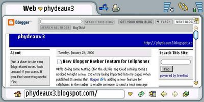
Sadly, when I tried it out on my Nokia 7710 smartphone (which comes with the Opera browser), I couldn't see anything in the navbar - the new link ought to be next to "Get your own blog":


Could be that it's just intended for "basic" mobiles without a proper full browser, but I'll leave it to someone else to check that out on a more basic mobile phone (or cellphone as the Yanks say)! Or maybe it's not fully live yet. But it's interesting, and an excellent idea as more and more cellphones are released which are powerful enough to surf the Web on.

I do think though that many smartphones with Web capabilities are likely to have email too, and therefore that Blogger should include an email "Check out this blog" link instead of (or as well as) a text/MMS link in the navbar.


Technorati Tags: , , , , , , , , , , , , , , , , ,

Sunday, 22 January 2006

It's the in colour, dahlink!


Why let feed subscription icons have all the fun? Firefox icon orange is clearly the new black (or is it silver?) - so, orange I shall be.

But seriously, in my efforts to doctor that photo to make it less identifiable, it ended up orange even before I knew they were trying to standardise RSS icons. I may be a bit geeky but I wasn't really trying to match feed icons. Honest.

And if anyone who's met me thinks it doesn't look like me, you'd be right. It's me, but as I blog anonymously I wouldn't pick a pic that was actually recognisable to anyone who knows me in real life, would I??

Just as well that orange is soooooooo me, dahlink. Innit?


Technorati Tags: , , , , , ,

Saturday, 21 January 2006

Related feeds: FeedAdvisor v Bloglines


Do you want to check out the "related feeds" of a particular blog to find more good reads similar to your favourite blog, or to see where others think your blog fits in? The ever-evolving Feedblitz, who provide a free feed to email service, have recently introduced a new FeedAdvisor feature, which claims to find and suggest feeds that are related to a particular feed. (They've since added access to it from the Feedblitz dashboard, and continue to tweak and tune it.) They describe this process as analysing what they call the "Subscription Web". They say it works via pattern matching using the aggregated subscription patterns of all Feedblitz subscribers. It:

"looks at your subscriptions. It then looks at all the users in the FeedBlitz subscription database who subscribe to the same feeds you do. It then looks at the content that these subscribers look at in turn, and then uses a proprietary algorithm to rank the content by relevance for you... Finally, the top three choices are presented to you. They're tailored to you, and are potentially unique for each and every individual subscriber in FeedBlitz" (but they say that "no personally identifiable information is revealed when the results are published").

Or put another way:

"FeedAdvisor analyzes the FeedBlitz subscriber database and maps your individual subscriptions to everyone else's. A proprietary algorithm then lists up to three new content sources based on the aggregated behavior of people who have the same subscriptions as you do. No individual preferences are revealed (that's obviously very important!), but the aggregate, emergent behavior of the entire population is boiled down to the top feeds that you seem to be missing."

And furthermore:

"FeedAdvisor constantly examines the subscription patterns in the FeedBlitz subscription database. But relevance is important, so after a certain point FeedBlitz will not make recommendations if the feeds do not appear to have sufficient weight in the population of subscribers like you. So, eventually the recommendations may stop - until a new content provider gets enough weight to be potentially interesting to you based on the FeedAdvisor analysis."

Now automatically finding related feeds is a great idea - but it's not actually a brand new concept. Bloglines, the free online feed aggregator that's probably the best known Web-based feed reader, have had a "related feeds" function since September 2004. I'll be describing that too, later on. But for now, back to FeedAdvisor.

How to find related feeds via Feedblitz's FeedAdvisor

There are several ways to find related feeds. To me, the easiest way (oddly enough it's not mentioned on the Feedblitz "how" page) to get FeedAdvisor's list of feeds related to a particular feed is to enter the feed URL in the search box at FeedAdvisor.com (incidentally Phil Hollows of Feedblitz has I see prudently registered FeedAdviser.com too, to cater for regional spelling differences - but where's the redirect from that domain, Phil...?). Try it for your blog (opens new window).

Of course FeedAdvisor works best if:
  • you know the exact feed URL to enter (though it seems you can word search, more on that below)
  • people are subscribing to that feed URL via Feedblitz, as FeedAdviser can of course only aggregate and match feeds which go through it, and
  • (to get meaningful results) enough readers subscribe via Feedblitz to both that particular feed and other Feedblitz feeds that FeedAdviser will have big enough figures to work from - hopefully the relevance will improve with more data, i.e. more feeds added to Feedblitz, more subscribers subscribing to different feeds, more time for more stats to build up.
So if you got zero results for your own feed ("There is not enough information in the Subscription Web to yield meaningful FeedAdvisor results. Please try again"), don't despair yet - you'd be in the same boat (on the basis of current searches at FeedAdvisor anyway) as, say (and you can try these links and you'll see what I mean), Scobleizer and Boingboing! In fact that seems to be the case with some (most?) feeds I try, including my own feeds. No doubt that's because Feedblitz haven't been going long, only a few months, and they don't have as many subscribers to multiple feeds as are needed to provide fully comprehensive related feeds info yet. Or maybe it's because people who subscribe to well-known blogs which have been going for a while and are popular with geekier types already use feed readers and don't bother with email subs?

Who knows - an illustration of related feeds given by Phil of Feedblitz uses a feed which has fewer readers than mine, at least on Bloglines, yet that feed has related feeds on Feedblitz, and my feed doesn't. But in any case they ought to append to that "Please try again" message something like "in a month or two", to avoid people trying the same search every day (or every minute, thinking it's like Technorati and its temporarily busy servers?) in hope or frustration!

Here's what positive results look like, if you're curious (or see the search results yourself direct, opens in a new window):


Now let's rewind a minute, I hear you ask. Didn't Feedblitz say related feeds are tailored to the individual subscriber based on their existing subscriptions? How does the straight FeedAdvisor search work then? It functions even if you're not logged in (to enable FeedAdvisor to access your personal subscription data), indeed it works even if you're not a Feedblitz member, so it can't possibly be personalised. Maybe the generic FeedAdvisor "related feeds" search aggregates all subscribers' feeds and then extrapolates from that, much as I suspect the Bloglines system does. It would be interesting to know how it works, and how (if at all) it differs from the "potentially unique" results for each subscriber.

Feedblitzers only?

Feedblitz seem to suggest that you have to publish or subscribe via them in order to search for related feeds, but in fact you don't (as you can see from the above - people can just search on the FeedAdvisor site). You just need to know what feed URL to enter. Obviously whether you get any results and how meaningful they are will depend on the number of people who do subscribe via them.

However, especially if you don't know the feed URL off the top of your head (and it's rare that you would), it's certainly easier to find related feeds if you're a Feedblitz member (bloggers who've submitted their feeds to Feedblitz are automatically subscribed to their own feed.).

To find feeds related to a feed you've subscribed to via Feedblitz, login to your Feedblitz dashboard. There's a search box on the front page like the one on the FeedAdvisor site, but again you have to know the feed URL. Or else you can click "Click to see FeedAdvisor at work" first, which takes you to your list of subscribed feeds, then click the FeedAdvisor button for that feed to see its related feeds (which I think is easiest) - or preview a feed by clicking the binoculars icon by the feed and scrolling to the end of the preview. (Presumably Feedblitz will take away the extra step of having to click "Click to see FeedAdvisor at work", which just seems an unnecessary extra step, and add the FeedAdviser function to the standard My feeds page - probably it's just a work in progress thing.)

Also, if you're a Feedblitz subscriber, your Feedblitz emails should list, at the end, the top 3 related feeds for that feed, as suggested by FeedAdvisor, but excluding feeds you're already subscribed to.

You can then preview any related feed, subscribe to it, or reject any feed which you never want to darken your inbox or preview page again. (I assume that last action would be noted by FeedAdviser and used to help tweak their algorithm.) Or you can click the FeedAdvisor button to find feeds related to one of those feeds listed, in turn, and just keep related feeds surfing for as long as they produce results.

Now you'll notice that the Feedblitz email and preview view only shows the top 3 related feeds. To view the full list of related feeds, use the FeedAdvisor button, or search FeedAdvisor via the front page of the dashboard or on the FeedAdvisor site.

What can you search; discrepancies; and how Feedblitz could lure in more subscribers

Now on to stuff I don't know but would like to know, and things Feedblitz don't do (in this context at least) which I'd like them to do (or think would be good for Feedblitz, from a marketing point of view, if they did. No charge, maybe they could just rope me in on their future betas...!).

The FeedAdvisor search (site or dashboard front page) lets you search for feed URLs. You can even search for words (like "blogging" or "gadgets" or "consuming"). But not blog URLs (I've tried). Yet if you search a feed URL it doesn't take you straight to its related feed, but to a page showing the name of the blog, with the option to click a FeedAdviser icon to find the related feeds for that blog.

The "Subscribe" page via the dashboard does however let you search blog URLs (and autodiscovers the feed URLs) - but you can't search for words. If you enter a feed URL it just subscribes immediately you to that feed. (Actually I wish it would offer you a preview option first, just in case, as the Subscribe button does on Bloglines - but it subscribes you direct...)

Why not make the two consistent to handle feed URL, blog URL and word searches on both? Why not allow the search function on the Subscribe page to accept word searches too, e.g. for blog names? (by the way I think "URL to Poll" is a bit user-unfriendly for non-geeks - why not "Enter URL of feed to subscribe to" or the like, and also make it clear that you can search for blog URLs as well as feed URLs?). And why not let a feed URL search on FeedAdvisor take you straight to the related feeds page for that feed to save time, and accept blog URL searches on FeedAdvisor?

I'd like to know how the word searching on FeedAdvisor works. If you search say "blogging", you'll find blogs listed that don't mention that word in their title. I blog about "blogging" a lot, yet my feed isn't in that list. What does it search, and how? Now if people could tag feeds on Feedblitz, Bloglines etc, I could understand that searching tags would work, and indeed I wonder how quickly feed tagging will be introduced by the major feed readers (Google Reader, which I covered previously at an early stage in its history, allowed "labels", i.e. tags, from the start).
(I personally think tagging individual posts is better than tagging entire feeds, except for blogs that have a very clear and consistent theme, one-track blogs so to speak. As with tagging blogs, with blogs which cover a variety of topics the tagging of entire feeds may perhaps be too general to be useful, or as useful as tagging posts anyway. The key difference would be that blog tagging is currently done by the bloggers, so feed tagging if done by subscribers would be more like tagging on Delicious, and so would be much more interesting in terms of the social networks effects.)

So anyway, how the word searching works on FeedAdvisor may have to remain a mystery for now, but I'd love to know the answer.

And the FeedAdvisor site could be a great marketing and publicity tool for Feedblitz - lots of people might well want to visit and try it out to find related feeds for their favourite feeds. Skipping that extra step mentioned above where the feed URL is entered direct would help. So would adding to the front page of Feedblitz and FeedAdvisor a note to tell users that they can even try word searching for feeds. But most of all, on the results page why don't they add a "Subscribe" icon next to the preview and FeedAdvisor icons, to enable people to just enter their email address and password for an immediate Feedblitz sub for a particular feed? And on the preview page you get to from FeedAdvisor, why don't they have a subscribe icon or link too? I think those are missed opportunities there...

In fact why don't they have a FeedAdvisor search box on their main page which non-subscribers can use, with access to related feeds, preview and subscribe links in the search results? That's what I'd do, if it were me - let people have the chance to enter their fave feed URLs or site URLs or word searches, see what a Feedblitz sub to a resulting feed would look like and how the related feeds would work, interest them that way, then get them to give their email address and password (taking a cue e.g. from Google Base, who cleverly draw you in by providing a "Post your own item" link and letting you fill in all sorts of stuff, before they make you register for an account!). That's one good way to bring in more users on the subscriber rather than blogger/publisher front - especially important given FeedAdvisor's emphasis on subscriber, rather than "blogerati", focus as its main selling point.

As I said, no charge! (or for the proofreading either.. ;) - "orinted" and "aeither" on the FAQs page, "About the Subscripton Web" on the FeedAdvisor site...?)

How to find related feeds via Bloglines

Any Bloglines user will have noticed that if after signing in you click on the name of a feed from your My Feeds list, on the right along the top, after the number of subscribers to that feed, there's a "related feeds" link. As I mentioned above, Bloglines have in fact had this feature since September 2004.

Just click on that link to see which feeds Bloglines consider are related to that feed. As Bloglines have been going for much longer than Feedblitz and must have a vast subscriber base, the results are not surprisingly going to be better, at least at the moment. Well I think they're better anyway, given that I got zero results for my blog on FeedAdvisor whereas Bloglines says these are the related feeds for my blog (which I'm quite pleased about really, it's pretty accurate in terms of what I blog about e.g. Creative Commons, though sadly for me, but not surprisingly, the converse isn't true - i.e. the related feeds for BoingBoing and Scobleizer don't include my blog on their lists!).

Another way to check related feeds on Bloglines, for a feed you're not currently subscribing to, is just to click Add under My Feeds, enter the feed or blog URL, find the feed and click Subscribe, then Preview this Feed, then click the "related feeds" link.

Related feeds: Bloglines vs Feedblitz FeedAdvisor

I've tried a few feeds both via FeedAdvisor (while not logged in) and from my dashboard (in the preview view), and the recommendations don't seem any different (though I don't use Feedblitz for many feeds), so I don't know how well the personalisation aspect of Feedblitz works yet. That's the aspect that seems unique to Feedblitz, which Bloglines doesn't appear to offer.

I don't know whose algorithm, Bloglines' or Feedblitz's, is better in terms of coming up with the most relevant related feeds. As I mentioned, I suspect FeedAdvisor doesn't have enough data yet to provide significant results in the case of many feeds. But for the two blogs which I know definitely have related feeds on Feedblitz, as they're the examples given by Feedblitz, you could get a rough comparison just by seeing the results:

Related feeds for Burnham's Beat on Feedblitz


Related feeds for Burnham's Beat on Bloglines


Related feeds for Build a Better Blog on Feedblitz


Related feeds for Build a Better Blog on Bloglines


As you can see, there is some overlap, but the results aren't identical (and why should they be, I'm sure they use different algorithms). Only time will tell how it all works out in the battle of the related feeds. It's an interesting move though, and the results should be even more interesting as Feedblitz's subscriber base and feed database grow, and they develop the personalisation aspect. I hope Feedblitz will unveil the word searching officially at some point (and explain how it works) - and I wonder if they'll introduce tagging?


Technorati Tags: , , , , , , , , , , , , , , , , , , , ,

Blogger: editing comments & popup window


If you use Blogger and you want to be able to edit (not just delete) comments on your blog, the easiest way is to use the Firefox browser and the "Edit Comments" Greasemonkey user script produced by Browservulsel based on Kirk's discovery of how to edit comments on Blogger. Until Blogger come up with a built-in comments editing function, I think it's the easiest way (see this post for what that script does), although there are other ways.

However, the edit comments icon it adds to most pages doesn't automatically appear in the popup window that appears when you click to post a comment (though it appears in that window after you've actually posted a comment e.g. to respond to someone's comment on your post). I think most people probably have a popup window for posting comments rather than inline comments on the post page, as that's Blogger's default.

So if you want to have the ability to edit comments easily from the popup comments window, this is what you should do:
  • in Firefox go to the Tools menu, Manage User Scripts
  • select "Blogger comments editor" in the list on the left
  • click Add
  • enter (or paste in) the following:
    http://*blogger.com/comment.g?blogID=*
  • click OK
  • click OK again.
That adds the edit comments icon to comments in the popup window.

I've amended my post on the script to add a note about this tweak. Thanks to Jasper for the info on the fix. No doubt at some point Jasper will update his script to add that to the included pages for that script by default.


Technorati Tags: , , , , , , , , , , , , , , , , , , , , , , , , , ,

Friday, 20 January 2006

Nokia 7710 smartphone review & tips 1: overview


This multi-part review covers the Nokia 7710 mobile phone/PDA, which only became available in the UK a few months ago. This post, part 1, gives an overview including features, what you get with the phone, and pros and cons. Future parts will cover tips and hints, accessories, software, support and troubleshooting - effectively I hope a practical FAQ on the 7710, as I haven't found a comprehensive single source yet. Please send any contributions you may have, which will of course be acknowledged.

Note that this review is based on the 4.0.10 firmware - a small upgrade came out in November 2005 but I've not got round to taking it back yet to get it upgraded. Here's what the phone looks like [added 24 Jan as Kirk doesn't believe it's a phone!]:


Overview

Specifications and features

The 7710 came out in November 2004 so it's quite long in the tooth for a mobile device. I've had it for about 5 months now. I won't repeat all details here, see the official specs. But I'd mention the operating system is Symbian 7.0, series 90 and it has 90 MB of internal memory (about 80 MB free). It's the only Series 90 phone: Nokia aren't bringing out any more, they will instead incorporate some of the series 90 features into some future series 60 phones.

It's rich in features: phone (of course) with speakerphone and voice dialling, text/multimedia messaging (SMS/MMS), Net access (GPRS/Edge), proper Web browser (Opera), POP/SMTP/IMAP email, FM radio, MP3 player, video player (Realplayer), voice recorder, 1.3 megapixel camera (with video capability), image viewer, basic graphics editor, drawing, contacts, diary, wordprocessor, spreadsheet, Powerpoint viewer, PDF viewer, ebook reader, calculator, converter, alarm clock, games, Bluetooth, USB, synchronisation with PC, upgradeable firmware, takes MMC card up to 1 GB, ability to use third party software including Java apps and games, GPS (if you buy e.g. a Tom Tom Mobile 5), and (if the service is available and you subscribe) "Visual Radio" and mobile TV capability (trialled in Oxford for O2 users, though still not available to most of us I think; still, check it out). Whew!

There's no keyboard on this "landscape" touchscreen device, just 6 hard keys, 3 on either side of the screen (left: navigation/select, menu, go to Desk (its desktop); right: zoom, switch, cancel/escape). On the side are 3 more keys for call, end/hangup and speakerphone/voice recorder). You can't do without the stylus, really. For input there's an onscreen virtual keyboard and handwriting recognition too.

In the box

Your mileage may vary. My Carphone Warehouse box included:
  • 128 MB MMC card with a few preloaded trial/free apps
  • charger (any Nokia charger works) and rechargeable battery
  • wired headset - one button only, doubles as aerial for radio
  • USB/pop port cable for connection to your computer
  • desk stand (2 pieces of plastic you slot together into an L shape)
  • printed manual
  • leaflet with code to unlock one trial app for the cost of a (possibly foreign) SMS text
  • leather case
  • CD with Nokia PC Suite.

Major pros and cons

The good

The screen, the screen, the screen! The bright, crystal clear LCD colour screen blew me away (65,536 colors, 16-bit, resolution 640 x 320 pixels). This display's the closest I've seen to paper - good enough to make me ignore a number of niggles I wouldn't have been willing to live with before; well I bought it the same day I saw and tried it. There are 3 zoom levels too, which helps especially with documents, email and (essential this, I think) Web.

Multimedia delight. See features list above; good sound quality particularly for its size (smaller than my Psion 5mx), and a reasonable camera with video function.

The ooooh factor - if that matters to you! People often ask what it is or exclaim when I get it to strut its stuff (or maybe they're just being polite...).

Proper web browsing (including full screen mode) on a wide screen, and POP email. It's GPRS not 3G, so it's slower than I'd like, but 3G via datacard is too expensive and walled gardens are anathema to me.

Handwriting recognition.
Fantastic - accurate and speedy enough to be truly usable, though I write fast (however input's slower than on my Psion 5mx with its lovely proper keyboard - two hands are still quicker than one). Writing's even faster than the onscreen keyboard, you can even start the next character before the last one's finished displaying. I've only had to change the way I write one character (t).

The bad

Size and weight. Bigger and heavier than most mobile phones, just about pocketable without the case (or with thin silicone or PVC case) if you have big strong pockets and don't mind risking your thigh or whatever going numb. Otherwise you need a briefcase or bag, unless (as I do) you use something like the Krusell belt system, to be covered in a future post.

Speed (lack of). Takes a while to power up especially after battery removal; apps take a few secs to get to especially if not already open; web surfing's slow. But the processor isn't up to much (boo to Nokia, they really should have put in a much faster one), so it's not surprising that the poor lil fella struggleswith that big high res screen. There's a new firmware version which came out in November but I should mention that I've not upgraded yet as you have to take it back to the shop to do so, a royal pain.

Volume. Really too low for either phone or music (much softer than say the Sony Ericsson P101i) unless you use the headset or speakerphone. Very hard to hear the caller if there's any background noise like traffic. You can't adjust the ear volume independently of the ring volume, which is a pain. Ring volume's not loud enough either, again especially in less than quiet environments. And you can't change the volume one-handed.

Too pen-dependent. The phone's just about dialable one-handed with fingers (though I wouldn't without a screen protector), but you need the stylus to text so you can't text one-handed e.g. walking down the street. Many options can't be selected with the hard keys. As I said, you can't do without the stylus, lose it at your peril.

It's buggy. I've had it refuse to unlock (see below on screen lock) even on entering the right PIN (the fix is to power off, which it the only thing it lets you do then, though normally it won't when the lock is on). It's crashed quite a few times, often requiring a full reset (covered later). You'll stuff up the voice dialling if, after the screen lock has kicked in, you forget to unlock it before trying to voice dial. It's catch 22, if you switch it off it takes ages to switch on again, but if you leave it on it seems to get increasingly unstable.

Too much dumbing down. This gadget will appeal most to power users, yet they're the very ones who most hate having their freedom of choice and control taken away from them (Nokia, are you listening?) System files are hidden, period. No option to view or manipulate them except with third party software. See also Niggles below.

Back cover blues. Removing the back cover is a challenge if you care about the 7710, your nails or your blood pressure (I'll give tips later - you'll need 'em!). As for closing it, I've never had so much trouble. You may think you've refitted it fully, having spent ages opening and closing it repeatedly and carefully pressing it shut all round, but if it's just a nanometre short of being completely shut in one invisible spot, tough luck. You see, continuing the unnecessary overprotectiveness/dumbing down theme, the 7710 downs tools completely if it thinks the cover is open. I repeat: it won't. Work. At. All. If it thinks, thinks, the cover is open. Even though it's as closed as you can make it without squeezing it in a vice, and believe me I've sometimes wanted to. What usability stupidity. I dread having to remove the battery or MMC card as it takes forever to get it to work again afterwards, it's so triggerhappy in claiming the cover is open. Oh and if it got jolted in your bag so a tiny bit of the cover ceases to be in contact with the main body all round, though no one would be able to tell, then guess what: it won't work. Never mind Nokia Streamer SU-22 as an "active back cover solution" (that was in the mobile TV context), they should implement a much more low tech kind of "back cover solution"! Grrr.

MMC card slot. Badly designed, doesn't secure the card properly so with everyday use the card sometimes comes out and then of course it won't access the card, so you have to open the cover to shove it back in, and pray that you'll be able to satisfy its paranoia about the cover being open when you try to close it again.

No built in encryption. Why not, given that business use is one aim? It handles Word and Excel documents, you can view Powerpoint/PDF docs, it even has VPN capability. Yet there's no ability to password protect documents! Big mistake. What's the point of being able to connect securely to your company network if any docs you save onto the 7710 are unprotectable? You can buy third party software for encryption but you really shouldn't have to.

Software. Not enough third party apps are available for it yet (and several Symbian developers I contacted said they don't plan to do 7710 versions). However I do see new software coming out for it from time to time, even a few weeks ago, so at least some people are developing for it or porting from their Series 60 or 80 software.

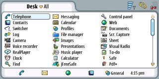
Battery life. Not the best, though it could be worse. I've found it has to be recharged every 2 or 3 days especially with heavy use (see the pretty red battery in the screenshot above...?), though once it actually lasted a whole week.

Nice things and niggles

The nice

Security. A security code (lock code) can be enabled via Control Panel, Security so if it's left switched on for a while a code is needed to use it (but not to answer calls), and you can lock it quite quickly. However this means you have to enter the lock code not just after you've left it unused for a while, but also on switch on (so you have to enter two codes on switching on, if like me you've also enabled a startup PIN code for the mobile part of it).

Music player keeps playing while you do other stuff on the 7710, cuts out when you use the phone, then comes back in when the call ends - now that's proper integration.

Quick dial or email or Web. Phone numbers (indeed most numbers), email addresses and Web URLs appearing in documents cleverly get recognised and if you tap on or near them a special icon appears by them, which if tapped calls the number, starts an email to the address or goes to the Website - very useful; if only this worked for all apps (like the spreadsheet) not just some.

Flight mode in Profiles turns off the phone so you can still use the 7710 on a plane just for the PDA/multimedia functions

Upgradeable firmware (but see Niggles below).

The niggles

Phone dialler orientation. Displays in landscape not portrait mode, which would have been more natural for the phone function and given where the mike and speaker are located (a friend couldn't even tell which way to hold it and which end to put to the ear, initially. Honest.)

"Welcome" music, go away! The little tune on turning it on can't be disabled. Senseless for a phone which is at least partly aimed at business users, as you can't switch it on during a meeting (the solution's to leave it on and switch to silent, but what if you forgot?). The startup sound can be disabled even on a relatively cheap Nokia e.g. the Nokia 7250i, so why not on this?

Saving docs. You can't save without closing. You can't choose where to save your docs. By default all files, documents, images etc are dumped onto a "Mydocs" folder on the internal drive. Messy. Part of the "dumbing down" mindset that doesn't let you close individual apps either. But see tips, later.

Pop port.
The headset cable pops out all too easily. I think that's all Nokia pop ports though, not just this phone. It really needs to be more secure for pocket use, as the phone just brushing against my leg can dislodge the cable.

Camera shutter lag.
Not as bad as some but noticeable, and only 1 zoom level (2x), no flash; no zoom for video at all

Firmware is updateable only by taking it to a Nokia service center (and it costs if you're beyond your 1 yr warranty period), plus as Nokia have discontinued this OS I doubt their commitment to update the phone.

Case. A bit bulky and (to me) badly designed - flips towards you to open, not away, the bottom edge rides up to hide the onscreen toolbar, and there's no clear top to protect the screen (it's just exposed). Missed trick: no belt loop, though there's room for one. Belt clip, even? Nope. Third party cases are much better.

Saving files. You can't save without closing (documents, spreadsheets etc) and you can't choose where to save files easily. There's a workaround for documents, which I'll mention in my tips.

"Realplayer" files aren't really Realplayer files but 3gp, a special format for mobiles, so it won't play "real" Realplayer files. However third party software can help with that.

Bluetooth pairing can be tricky though USB connection works fine.

Memory. Occasional warnings that memory's too low, apps not opening or working properly e.g. camera pics not saving. But this can be dealt with, see future post.

Apps handling. There's no way to close most built in apps individually, hence the occasional memory problems, but again the same solution applies

SIM card slot. A bit fiddly to insert/remove (you need a pencil tip or something), and the indicator showing which way to orient it is almost invisible.

No Wifi. But in London it's not like free hotspots abound. No infrared either, but at least there's Bluetooth.

Images. No slideshow-type function to move from fullsize image to next fullsizeimage, that I can see. Have to switch to thumbnails and select the next image to see it fullsize, which is slow.

Synchronisation. Supposed to synchronise with Outlook or Lotus but I couldn't get it to work properly especially things going into the wrong fields in Contacts.

No PDA without phone. The PDA functions can't be accessed unless you have a working SIM card in it, at least from my experiments. Shame.

The verdict

It depends on what you want. I was seduced by the clear, wide screen, which I still love, and bought it in the white hot heat of passion, though I now have moments of regret. Its greatest benefit to me is being able to use my Gmail while on the move (and access the occasional website on a proper-sized screen, though it's slow). To me it's been worth it just for that.

However, as a phone it leaves a lot to be desired (I can cope with the size/weight using a belt attachment system, but it's the inadequate volume that's the killer). If your main need is for a good phone for voice and texting, with PDA functions on the side, I'd say don't buy the 7710.

As a PDA it's just that bit too slow (though the November 2005 firmware is supposed to have improved speed so I'll report when I get the upgrade), and while the handwriting recognition beats most others' hands down, the lack of a keyboard supporting two-handed use and the inability to copy/paste text direct from the 7710 to my PC (which to be fair most PDAs don't support) means me and my trusty Psion 5mx are still joined at the hip. But maybe that's just my own PDA needs (I work on blog posts etc a lot on the Tube or bus, in waiting rooms, etc): I simply have to have a proper keyboard I can type on, anything else is too frustratingly slow for me.

Nokia could have been on to a real winner here, particularly with the vast majority of people who don't need a real touch typeable keyboard, if they'd only given the 7710 a processor of about one and half times or double the power, made it insensitive to the supposed open/shut state of the cover, doubled or trebled the audio volume, improved the battery life and supported it properly with regular firmware upgrades to iron out the bugs.

However I can only advise strongly that you try it out in person fully in the shop before you buy and ignore the impulse to grab it, that's just the ooooh factor leading you into temptation! Also, check out:

One more thing to watch - if you buy from Carphone Warehouse, it's cheaper with a contract (as low as £50, maybe less by now). Also, they'll tell you it's a Vodafone or O2 contract. Actually it's a Carphone Warehouse contract using space on Vodafone or O2, which means you don't get the full Vodafone etc customer service but a Carphone Warehouse customer service at national rate with limited opening hours, and I believe if the network's busy then "proper" Vodafone customers get priority. I should have read the small print but I didn't; their brochures and sales reps led me to think it was a real Vodafone contract (I don't think I'd have signed if I'd known it wasn't), and because of that, after the contract expires, I don't plan to buy from Carphone Warehouse again unless whatever replacement mobile I get really isn't available from anywhere else.

The next part of this review/guide will cover tips and howtos on the 7710 (hey, once you've got it, might as well make it work for you).


Technorati Tags: , , , , , , , , , , , , , , , , , , , , , ,

Thursday, 19 January 2006

PubSub: user survey


Well it must be something in the air. PubSub, the "matching engine" which I've blogged about before, have just launched their own 9-question survey (you need to accept third party cookies to answer it), mere days after Technorati's own 33-question user survey.

Their questions are fewer than Technorati's but more open ended, like how you'd describe PubSub's accuracy, what other types of topics you'd like offered, and what 3 things they should (and should not) change. Plus the usual how long you've been using it, what you use it for, are you a registered user, how many subs do you track daily, and of course would you be willing to pay a monthly fee for business use. Interestingly they don't seek detailed (or indeed) any demographic info, so perhaps advertising funding is not the way they are planning to go, or maybe they're focussing on improving the "user experience" (as they say!) first.

If you're not too survey fatigued, then why not take PubSub's survey too, and tell 'em what you want.


Technorati Tags: , , , , , , , , ,

Wednesday, 18 January 2006

Automatic categories & Technorati tags 1: principles


This 2-parter describes one possible way to include categories for your blog posts automatically with Technorati tags, if you're using a blogging platform (most notoriously Blogger) which doesn't support categories. (Previously I explained how to implement a manual categories method which is quick and easy for users but involves much more ongoing work for the blogger, though CoLT makes that a lot easier.)

Clearly many of us have been thinking along similar lines lately, e.g. see my fellow Web Corante Hub contributor John Tropea's recent post. A popular semi-automatic method has been to use Del.icio.us, see e.g John of Freshblog's post, but I was too lazy to go and tag all my old posts on Delicious, so I never tried that out myself. This new method, which I've been trying out since I discovered that Technorati have introduced much more powerful tag searching, should involve much less work going forward (always a good thing in my book), and it can even pick up your old tagged posts, but it still takes some time and thought to set up.

If you're curious, you can see the new system in action on this test blog (opens in a new window). It looks much like the manual system at the right hand side of this page, but peek under the skirt (as some would say!) and it's quite different. Why am I not using it on my main blog yet? Because I want to see how it goes in terms of speed and reliability and accuracy from day to day and different times of the day, and I don't want to risk slowing down my blog for my readers or confusing them with error messages by having it there until I'm completely happy it will work smoothly.

I'll outline the basic principles behind this method with some of its pros and cons, and then provide a practical step by step guide on how to implement it on your own blog. (I'll probably split the howto out into a separate post for length reasons as there are some twists involving how Technorati seem to have changed things on their site recently, which can hide certain things you need - I'll explain how to find them).

Concept

This system depends on searches of Technorati's tag pages and then conversion of the tag search feed to Javascript which is inserted into the blog template to display the search results, i.e. show a list of posts, under your chosen category headings on your own blog (rather than opening a categories page on Technorati or on Del.icio.us). So you can categorise even your old posts with this method if you've tagged them appropriately in the past (including with meblogging tags), without any re-editing at all, and a post can easily be filed in more than one category, again just by tagging it appropriately.

Tagging and tag searching

You need to spend time thinking carefully about what categories you're going to have and the tags for the posts that you want to be listed in each category, how to construct your search so as to pick up previous posts (if you've not been tagging with consistent keywords in the past - which means combing through your old posts, checking what tags you used for them and trying out various search combinations), and of course you need to be consistent in tagging future posts that you intend to file in a particular category, though that'll be a heck of a lot easier than figuring out how to rope in all your old posts. You won't be surprised to know I've been working on this on and off for a couple of weeks, even though I've only got blog posts going back about a year.

Also note that because this system uses Technorati tag searches, someone else's posts from another blog could get listed in your categories if they've used exactly the same tag combo you've set your search up for (that's why meblogging tags are a good thing, and this system relies on them - and also assumes others won't use your meblogging tags, not much anyway!).

Reliance on Technorati

If a post isn't on Technorati's tag pages, e.g. you didn't tag it with the right tag or Technorati's tag pages haven't clocked it for whatever reason (which is a common problem for many blogs), it won't get categorised automatically. (Obviously, new posts won't be listed in your categories until spidered by Technorati, which should only take hours or less these days.) So you still need to keep an eye on Technorati's tag pages periodically (e.g. do a tag search) to check your new posts have been properly picked up on there, and sort it out with Technorati support if not (or just add the missed posts manually, see below) - which is counter to the "automatic" aim, but at least that's all ongoing work you'll have to do, and it's easier than manually hardcoding in every single one of your new posts. If Technorati could only solve the issues that stop them adding all tagged posts to the right tag pages consistently without fail, and beef up their systems so that users will never again see the dreaded "too many searches try again later" message instead of the desired search results, this method would be so much easier, and indeed it would become my own personal favourite.

The Technorati dependence also means that if Technorati is temporarily out of action, or slow, or not producing any search results because of too many other searches, that will affect the speed of loading of your blog and the display of categories lists on your blog (e.g. if the Technorati search or feed is playing up). If Technorati's down, who knows if that might even stop your blog pages from displaying altogether (as happened with blogs or posts linking to MP3s which incorporated Del.icio.us's Playtagger, when Delicious's servers went down) - though I think Javascript errors popping up, see below, are more likely than your pages not loading at all.

The main problem with using Technorati so far as I can see, apart from Technorati not always showing my tagged posts on their tag pages, is that sometimes the searches are too slow, or, even worse, about 1 in every 4 or 5 searches on Technorati (in my experience) just produces no results but a "try again later" because the server's too slow to respond or too busy with other searches - which means that instead of a nice neat list in the sidebar, the reader sees unfriendly Javascript errors. Though refreshing/reloading the page usually sorts it (and hence I changed the heading in the test blog sidebar to suggest it), I'm obviously reluctant to put my readers through that experience; people unfamiliar with an error like that might well leave my blog instead of refreshing. (Incidentally, I think cracking scalability, maintaining the ability to cope with ever-increasing numbers of searches, is going to be a critical issue for all search engines generally, not just Technorati - I've even started seeing "can't find server" type results on Google searches, though less frequently for Google searches, which are after all their bread and butter, than when trying to view Blogspot blogs, which I'm guessing Google host on less heavy duty servers.)

As the category list simply reflects the posts shown on your Technorati tag search results page, the Javascript will show only the 20 most recent posts for a category because that's the maximum number of posts Technorati currently list on their results page in Internet Explorer (but there's an odd discrepancy with Firefox, where it's only 10, which I'll go into in my later howto post). However, I've done a manual tweak for each category that has more than 20 posts by providing a hardcoded "...more" link to open Technorati's page 2 for that tag search in a new window - but only for those categories, as for ones with fewer posts that format of link would just gives zero results on Technorati and a horrid screen for users. (It would be possible to write a script to count the results and produce a "...more" link to the correct page for that category on Technorati only where there are more than 20 results, but it's more thinking and trouble than it's worth for me, so I haven't - if I had lots more categories it would be more useful, as it is it's just easier to add the "more" link in manually when my remaining few "small" categories hit 20 posts).

RSS to Javascript conversion: a feed is essential

For displaying category lists on your own blog (as opposed to just having a category heading linking to a page on Technorati listing those posts, which is possible if that's as far as you want to go), I used a free feed to Javascript converter (there are lots around). Which means this system only works for searches with feeds, like Technorati tag searches (http://www.technorati.com/tag/whatever). You can't use plain Technorati search results (http://www.technorati.com/search/whatever) as Technorati offer no feeds for those, unless you create a watchlist, which is extra trouble I couldn't be bothered to go to (also, standard searches as opposed to tag searches just aren't as precise if you're trying to limit it to just posts from your blog).

More unfortunately, this system won't work for tag searches which include "user=yourTechnoratiusername" e.g. http://www.technorati.com/tag/BBC?user=improbulus (as pointed out by John Tropea in December and whose possibilities have been spotted e.g. by Unrest Cure). This is because, sadly, Technorati don't yet provide feeds for those kinds of searches (or for "from=blogURL" searches such as http://www.technorati.com/tag/Technorati?from=consumingexperience.blogspot.com). If and when Technorati introduce feeds for tag searches using user= or from=, that would be ideal because you wouldn't get other people's posts popping up in your categories even if they used your meblogging tag, as you'd use "user=yourusername" or "from=yourURL" instead of the meblogging tag. (Dear Technorati... pretty please?) You can still use these kinds of searches, if you like, to provide a link to a separate categories page on Technorati's site - you just can't use them to list out your category posts on your own blog, not with simple RSS to Javascript conversion anyway.

Again, because this system depends on a feed to Javascript converter, your blog pages will load more slowly than usual because of waiting for the scripts to do their thing (remember it will be fetching the search results for each category separately, and the more categories you have the longer it will take). You can see that the pages on my test blog (new window) open at a rather more leisurely pace than on my normal blog (though hopefully not unusably so) - the sidebar appears only gradually, although at least it doesn't stop the main text of the post from being fully readable from the start, even with a long post.

Furthermore, again this also means that if the site you use for the conversion is slow, or down completely, then your categories list or even your whole blog could be affected, e.g. if the converter somehow doesn't pick up the Technorati feed. One major downside of this system is that it relies on two separate services, Technorati and the feed converter both, so if even one of them is up the spout then your blog could be scuppered.

Combine with manual categories?

However a major benefit is that you can combine this method with manual listings of posts, so you have a lot of control. I've done that in my test blog (new window), which still makes use of my show/hide method.

So for some categories like the Technorati one, I display my most popular or personal fave posts first by manually hardcoding them, then I insert the Javascript for that category (which lists out the most recent posts for that category, in reverse chronological order), then (again manually) I hardcode the list of posts which should be in that category but which Technorati wouldn't pick up. (Yes, this takes some work, comparing Technorati's tag pages for your combo search against your universe of posts to see what's been missed out and then adding them in by hand.) You may see some duplication of posts - e.g. because they weren't on Technorati's tag pages when I was checking it, so I hardcoded them in, but now they're appearing... still, better twice than never.

Why Technorati?

Now some of you may wonder why you need to use Technorati for this - why not e.g. rival blogosphere search engine Icerocket? Icerocket have their own tag pages, called "blog topics", with tag and author combo searching and a feed for every conceivable search result.

But - they only introduced tag pages around mid-2005, so they haven't got as many of my posts on their tag pages as Technorati do, despite my (unsuccessful) attempt to get more tagged posts on Icerocket; their multiple word tag searching and AND/OR tag combo searching doesn't work as expected, from my tests; plus, on the can't beat 'em join 'em front (that's me being all dry and sarky), Icerocket have also started having problems crawling/indexing my blog (all my posts for the second half of December 2005 are missing from Icerocket for example) - and the situation is worse with Icerocket than with Technorati. With Technorati, while a number of my posts are missing from their tag pages, at least they're still there somewhere on their database, because you can find them via a simple search on Technorati if not a tag search - whereas with Icerocket, my posts just haven't been indexed on there at all; they're not there, period. So personally I'm sticking with Technorati.

If your blog is newish and you're sure all your tagged posts are on Icerocket, if you want to then feel free to use them instead (their searches do seem to be faster at the moment); but I'm only going to provide a detailed howto on Technorati in the second part of this tutorial.

So those are the principles behind this automatic categories system. In part 2 I'll outline the practical steps involved in implementing this system, and go into more detail on how to address some of the cons I described above, with some advice and tips on the different stages.


Technorati Tags: , , , , , , , , , , , , , , , , , , , , , , , , , , , , , , , ,

Technorati: user survey


If you've visited blogosphere search engine Technorati in the last couple days, you'll have noticed their new 33-question survey (and if you haven't, now you know about it!).

It's open for a "few days" so take it if you want to have your say. The box for "Do you have any suggestions for how Technorati could better serve your needs or those of the people you know?" is in question 33, so even if you are dying to give your comments or suggestions (e.g. about the problems with tag pages, or searches failing because of a high volume of requests), you need to work your way through the other 32 questions first - but they're pretty quick to answer.

As Niall Kennedy explains on the Technorati Blog, there are a bunch of demographic profiling and visit type/frequency questions for the benefit of Technorati's advertisers, including how many of their visitors blog, how often they post, do they tag their posts, what other blog-related services they use, are they a Technorati member, have they claimed their blog on Technorati, how did they hear about Technorati, how often do they visit and which services they use (e.g. Mini, RSS, watchlists, checking blog ranking etc), and their general view of Technorati and its ease of use.

The other questions are interesting to the extent they may give hints about Technorati's future direction, or at least the way they're currrently thinking about their possible future direction. For instance there are a number of questions about people's use of Technorati - to monitor comments about themselves or their blog, or about their company or business or clients, or community/world news; and to what extent they use Technorati for their job/business purposes.

There are queries to gauge interest in seeing mainstream media content alongside blog content, and user interest in searching contacts, reviews, calendar events etc (i.e. standardisation of microformats for those, and the whole structured blogging thing - though it seems to me that the main issue is going to be how they compare against Google Base and its searchable flexible databases for reviews, and yes calendar events etc etc, and it will be interesting to see how all that plays out). And of course, they want to know to what extent users would be willing to pay for advanced services whether for personal or business purposes; maybe they're thinking of charging for business use.

I suspect Technorati are unlikely to publish the results, not in full at least, but you never know - I for one would be very interested to see a summary.


Technorati Tags: , , , , , , , , , ,

Tuesday, 17 January 2006

PubSub: beta testing upgrade to Sidebar


PubSub, whose "matching service that instantly notifies you when new content is created that matches your subscription," will "soon" release new versions of their sidebar (which shows your matches live in a sidebar in Internet Explorer or Firefox).

The improvements are said to be:
  • Auto-reconnect support that reestablishes the session after a network interruption or when the user’s machine awakens from hibernation.
  • An options menu for configuring user settings.
  • A new option allows display of the PubSub LinkRank of the currently viewed page.
  • Automatic detection of LAN proxy configuration, with automatic tunneling through the proxy on port 443, which should enable use of the Sidebar in many firewalled networks.
  • Backend improvements to ensure faster and more reliable message delivery.
  • Some bug fixes to improve stability.
Live matching is potentially very useful (though Pubsub now have the Technorati Mini to contend with, which can also be used in a Firefox sidebar and even Opera panel), but on my system Pubsub's sidebar has never worked properly in either IE or Firefox, with zero results even when their feed had content, or results that didn't quite make sense, so it will interesting to check out how much better the new version will be.

Pubsub are asking would-be volunteer beta testers to email them at sidebar@pubsub.com


Technorati Tags: , , , , , , , , , , , , , , , , ,

Monday, 16 January 2006

BBC: iMP MyBBCPlayer free downloads - key issues


FURTHER UPDATE: on how to sign up for the public iPlayer trials, and for screenshots and a video of iPlayer in action, see
this post.

UPDATE: free download of BBC TV programmes, for a limited period after initial broadcast, should be with us in May or June 2007 via the new BBC iPlayer - with UK-based computers, anyway. See this post.


I've been participating in the limited trial of the BBC's iMP or MyBBCPlayer, where you can download and replay certain BBC programmes for free up to a week after the broadcast. Previously I gave my initial thoughts plus some detailed tips and tricks on MyBBCPlayer.

This post sets out what I feel are the most important barriers to mass take up of iMP, which in my view the BBC must address if they want iMP to be a success:
  • how and where - playback on TV or portable devices (PMPs, smartphones etc)
  • what - the content
  • when - expiry/timing restrictions, life's realities and DRM (digital rights management)
  • finding the stuff - the programme guide's design and usability.

Playback on TV and other devices

The BBC's Listen Again for radio programmes (playback within 7 days after broadcast) has been very popular, and their audio podcasts and MP3 downloads have gone down well too (see this post). Common feature: they're audio. It doesn't matter hugely where the sound comes from as long as you can hear it and the sound quality's decent, and you can have it playing in the background while you do other things.

Video is different. It requires more direct attention, people don't multitask so much while watching TV. Particularly if it's a DVD you've rented, a missed show you've downloaded, something you've actively sought out, you will want to be able to watch it properly. Watching video's often more social than listening to radio (catching a programme with your mates on a sofa via a widescreen TV beats crowding round a monitor, even a large one, standing up all the way through the whole show). And how you are able to watch video, where the video can be displayed, matters much more than with radio.

What all this means is that easy playback of downloaded shows on a proper TV is essential. At best there should be a set top box. But as a bare minimum, very clear and simple instructions on how to get the replayed program to display on your TV, and a list of compatible gear to buy, will be crucial for the vast majority of people who just aren't AV or computer techies. People would I'm sure be willing to buy a set top box for the purpose (provided of course the other issues like content etc, see below, are addressed properly). And indeed on the iMP forum BBC staff have mentioned trials with digital media receivers to transmit downloaded programmes wirelessly to the TV. So clearly they're aware of that key point - and I personally believe that for the vast majority of people who are not geeks, it will be a critical issue.

Providing a choice of options for watching is also important, and it's laudable that the trial has permitted downloads of mobile versions to be transferred to certain mobile devices (Orange SPV c500 only in this trial, with Windows Mobile 5.0 Windows Media Player 9 or above) and hopefully they're extending this to other mobiles, PDAs and personal media players (PMPs) generally, Windows Media Centre etc. Further flexibility in copying and transferring would be even better, but that's straying into digital rights management (DRM) territory, see below.

Available content

So far, to be honest I've not watched much via iMP. The concept is great but not being able to playback programmes on my TV is off putting. However, a bigger reason why I've not used it as much as I'd hoped is simply that there's not been much on there that I've wanted to watch.

I know the BBC is trying hard to negotiate with a zillion rights holders for permission to offer their programmes for replay. It can't be easy. But if too many rights holders refuse, then that could really scupper the future of iMP. What's the point of developing the means of delivery when the content is such that not enough people will want to watch it to make it all worth it?

What about the BBC's archive of classic shows? Wouldn't it be more in keeping with its public service remit if licence fee payers could re-watch those shows by downloading them? And why don't Channel 4 and Channel 5 allow replay of their broadcasts too? I watch programmes on those channels more than on the BBC, these days. I know they will have even more difficulty getting the rights to do that e.g. for Lost, but the more who ask for it, perhaps the greater the chance that it will happen one day.

The availability of content that people actually want to watch is clearly going to be another big issue.

Expiry restrictions, realities and DRM (digital rights management)

One major bugbear is that you can only replay a programme within 7 days after its original broadcast. After that, tough luck - it's expired and the in-built digital rights management system stops any replay.

It's the same for radio's Listen Again, but somehow it's more of a problem with me than for radio - maybe because I watch a lot more TV, so being able to catch up on a missed show matters more to me than with radio. Plus TV programmes are often longer than radio programmes, so you need a bigger time window in which to be able to watch a replay - and having to find that time window in just 7 days when you already lead a busy life (which is probably why you missed the programme in the first place!) is simply harder than if you had say 2 weeks to watch it in. And if you are on a 2 week holiday you won't be able to replay something broadcast during the first week, too bad.

Personally I see no point in the 7 day limit. If I got my act together enough to program in advance a recording of a show on my VCR or, more likely, PVR (personal video recorder), I'd be able to replay it anytime I like. And I could keep the recording for as long as I liked and even replay it again. Recordings can be made to DVD now, or to hard drive then archived to DVD. Even digital recordings from Freeview. So the 7 day restriction is in fact a backward step, especially as there are moves now in other quarters to provide video on demand regardless of when the broadcast date was (e.g. AOL's In2TV which will allow download of classic TV shows), and BT's plans from autumn 2006, to offer "...a vast range of on-demand film, music and television programming…" to provide "...BT customers nationwide with choice, convenience and control over their home entertainment without the need to commit to expensive monthly subscriptions… straight to their TV" (Philips will supply a set top box to deliver these high definition services and the software platform will be Microsoft TV IPTV Edition).

Presumably it's the rights holders again insisting on the 7 day "self-destruct", but it really serves no useful purpose to them as far as I can see, given that people could much more easily record the live programme on Freeview and, yes, pirate that if they want (I suspect those who buy pirated stuff wouldn't hugely care about the difference between a digital recording off Freeview and a copy of an iMP downloaded file). Sure, maybe the iMP video quality is better (I haven't looked into that, though I seriously doubt it's vastly better or, more to the point, that people would care that much), but I've seen comments on the iMP message boards that it's not difficult for hackers to crack the protection and copy the downloaded shows, 7 day limit or no (they can just do it on day 1, can't they). So the limit doesn't really stop bad hackers, it just makes life a lot harder for the rest of us.

Why not make it 14 days? Or make it 7 days after, not the broadcast date, but the date the user first tries to replay it or the "licence acquistion" date (e.g. give the users 7 days after they get back from holiday, even if it's more than 7 days after the broadcast date). Surely that would be the most sensible compromise, if the rights holders insist on clinging to the false security blanket of some definite expiration/self-destruct limit.

More on digital rights management: VCRs didn't kill off the film or TV industry, in fact they provided an extra and lucrative source of revenue. Same with DVDs, including recordable DVDs. So why not provide downloaded iMP files which don't self-destruct, in common non-protected formats, which users can easily transfer to their portable devices to watch when and where they wish? It's the same argument: call me cynical, but bad hackers and organised crime will I suspect have little trouble cracking the protection anyway. All that those restrictions really do is make life much harder for law-abiding consumers who've paid their TV licence fees.

(As an aside, it's the same with introducing ID cards associated with computerised personal data - they'll make life more difficult for law-abiding citizens and grossly compromise our privacy and security by collecting our personal information in one handy place for criminals like identity thieves to break into, while barely deterring terrorists and mobsters who have easy access to top forgers and black hat hackers.)

Finding the stuff

Obviously even if they improve the content available it's no good if the interface to enable you to book downloads is buggy, or you can't easily find stuff to download. The iMP TV/radio guide interface looks nice but doesn't work very well yet in terms of user-friendliness. Of course, that's a major reason why there are trials. I've gone into detail on some of the issues I've encountered in my previous post.

It should use a standard interface with proper visible menus, Back and Forward buttons, conventionally resizeable windows etc (see my my previous post). The search box should be on the main page like Home and Guide rather than (or as well as) on a separate tab, there's certainly space for one on the left. It’s also supposed to search just the programme name, but I've found it searches the description too - it would be good to have the choice of searching either or both. And when searching I'd like to be able to specify just radio, or just TV.

Searching for a show whose name you already know usually works, but it's less easy trying to browse for e.g. films, as mentioned in my previous post. It needs to have much better filtering when users click Next or Previous. Sorting by clicking a column heading would be nice, you can't at the moment. Other navigation issues: if you rightclick the iMP icon in the system tray and choose the "Open your programmes" menu item, I feel it should go to the "Your downloads" tab (i.e. the programmes you've downloaded) by default - otherwise it isn't "YOUR programmes", is it??

I also have other design or usability niggles like the unnecessary popup which you then have to close saying "No scheduled programmes available for selected day" - I can tell that from the lack of anything in the search results! I have other usability quibbles, e.g. to get more info about a programme you have to click the "All" button under Series (rather than a button labelled "Info") - not at all intuitive; and a "Today" button for orientation would be nice. An indication on the Downloads page of the date when downloaded programmes expire would really help; yes you can calculate that from the Broadcast column but an Expiry Date column would be more user-friendly.

A major issue is that it still sometimes doesn't work properly. For instance one of the shows in their email newsletter to triallists wasn't visible for the day and channel it was supposed to be showing on, yet when I did a search it appeared. I'd also add that there are still bugs to be ironed out, e.g. error messages like "You have exceeded the disk space allocated" (when I've hardly downloaded anything and gave it loads of space), and the more cryptic (I spare you the details) "An error has occurred in the script on this page", "Delivery error", etc.

In terms of speed, surely some downloading in the background of some of the pages would help. I'm on 2 MB broadband and using the programme guide still quite slow. And there are other issues like user control (lack of option to NOT load iMP automatically at startup if the user doesn't want to). I would love full keyboard shortcuts. Plus, wouldn't it be great if you could rightclick a programme and have a "Share this" or "Email this" option, to email a "link" to the programme to a friend to suggest they download that programme too?

The ideal to me would be a full TV-guide style interface with a timetable view showing times/channels (rather than alphabetically by programme name as it is now), like a paper TV guide, or like Digiguide's electronic TV/radio guide, which I've subscribed to since I first tried it. Why can't the BBC do a deal with Digiguide to integrate iMP downloads with Digiguide's brilliant guide, which is so much more user-friendly and powerful, and indeed mature and tested, having been known to work properly for years now? Or get a special BBC-only version of Digiguide just for iMP which they can then provide for licence fee payers to download? Say a rightclick to download a show, automatic downloading of shows matching a particular search, etc? We can but dream...

Conclusions

So, overall, I think the BBC are to be applauded for their efforts to bring TV broadcasting into the 21st century (and their website is excellent - I feel that broadcasting, whether via traditional means or the Net, and the complementary information they provide on their website, clearly should be within their remit). However, much more thought and work are needed to make the venture worthwhile, and in particular I hope they will free themselves from the shackles of 20th century thinking, or perhaps more accurately drag the rights holders kicking and screaming into the 21st century. They have a great opportunity here, and if they remember that empowering users is the key, giving increasingly time-poor consumers the freedom and flexibility to choose the what, when, where and how of TV replay for themselves, then MyBBCPlayer could really take off - especially if channels like Channel 4 and Channel 5 also provide replay facilities.

UPDATE: free download of BBC TV programmes, for a limited period after initial broadcast, should be with us in May or June 2007 via the new BBC iPlayer - with UK-based computers, anyway. See this post.


Technorati Tags: , , , , , , , , , , , , , , , , , , , , , , , , , ,